
Seamless Integration with Vuetify, Guaranteed
A comprehensive and customizable design system with 154 components, perfectly aligned with Vuetify for seamless design-to-code transition.

150+
Created components
80+
Variables
25
Styles
500+
Variants

This features to help you build your website seamlessly in figma and code.
Make yourself at home
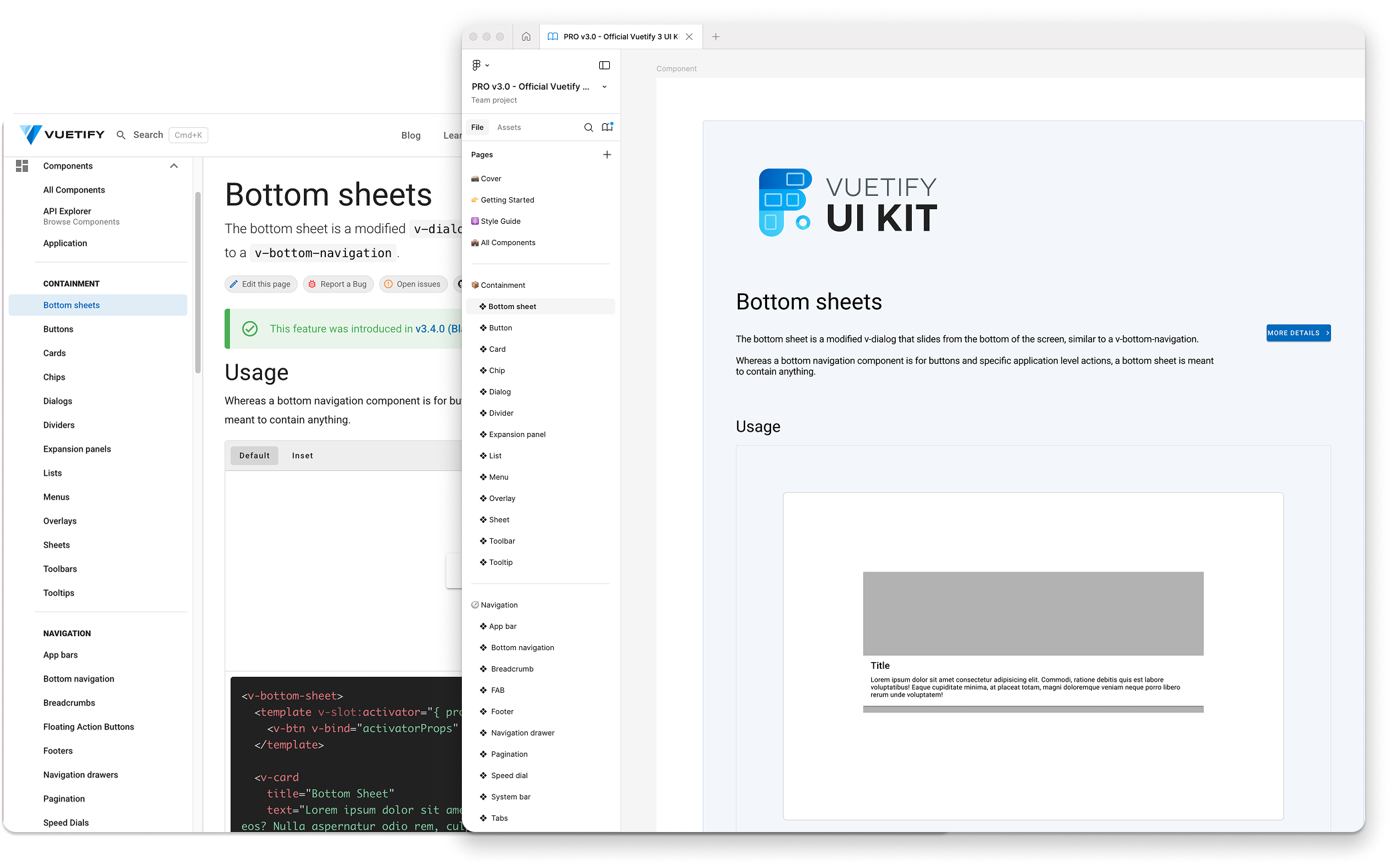
The entire Figma file is organized in the same way as the Vuetify site. This makes it easier to find what you're looking for.
Light and dark
The Vuetify Figma comes with both light and dark modes. This makes it easy to design for both themes.
Components
The Vuetify Figma comes with all of the Vuetify components. This makes it easy to design with the same components that you'll use in your app.
Material Design
The same Material Design principles that are used in Vuetify are used in the Figma file.
Customizable
The Vuetify Figma file is fully customizable. This makes it easy to change colors, fonts, and other design elements.
Pricing
Choose a plan that works best for you and your team.
Vuetify UI Kit — PRO vs FREE
Design faster with 1:1 Vuetify components, production-ready variants and style controls (colors, densities, radius and states) that adapt to any brand. Choose the version that best fits your workflow.
Why PRO
Recommended- 150+ components with 1:1 names and structure with Vuetify.
- All variants (elevated, flat, tonal, outlined, text, plain…) and complete states.
- Advanced foundations: 7 color roles, densities, radius, borders (color/width/opacity).
- +4 modes by variables (light/dark and more) to scale brands and themes.
- Updates synchronized with the library and direct support.
Ideal for
Teams & Startups
Faster delivery, total consistency and less rework.
Freelancers
Winning proposals and clean handoff with devs.
Design Systems
Variables, tokens and real theme scalability.
Dev Teams
1:1 parity with Vuetify components to implement without friction.
 FREE
FREELicense
- All components included
 Dark & Light Modes
- All variants included
- Color Roles
- Advanced foundations
- Updates & Support
 PRO
PROPersonal
-
All components included
- Dark & Light Themes
- All variants included
- Color Roles
- Modes by variables
- Updates & Support
PROCommercial
-
All components included
- Dark & Light Themes
- All variants included
- Color Roles
- Modes by variables
- Updates & Support
PROUnlimited
-
All components included
- Dark & Light Themes
- All variants included
- Advanced foundations
- Modes by variables
- Updates & Full Support
VFieldQuick Start Your Vuetify-Aligned Design Journey
Craft beautiful interfaces with a system designed to streamline your workflow from Figma to code. Join a growing community of designers and developers who trust our library for their projects.